The best Divi landing pages have one main purpose and that is to convert visitors into leads. Making sure that your landing pages have the ability to attract your audience is an absolute must.
As the center of marketing optimization, it is important to make sure that the elements of your landing pages are placed in a way that boosts your page’s functionality and efficacy.
Times have changed a lot ever since the development of these page builder tools. There was once a time when websites were done from scratch, and can only be built by web developers through HTML and CSS coding.
It was a tedious and time-consuming task. This is probably why having the Divi Builder makes page building a lot easier. With their Visual Builder feature, you can now make pages on the front-end of your website with ease.
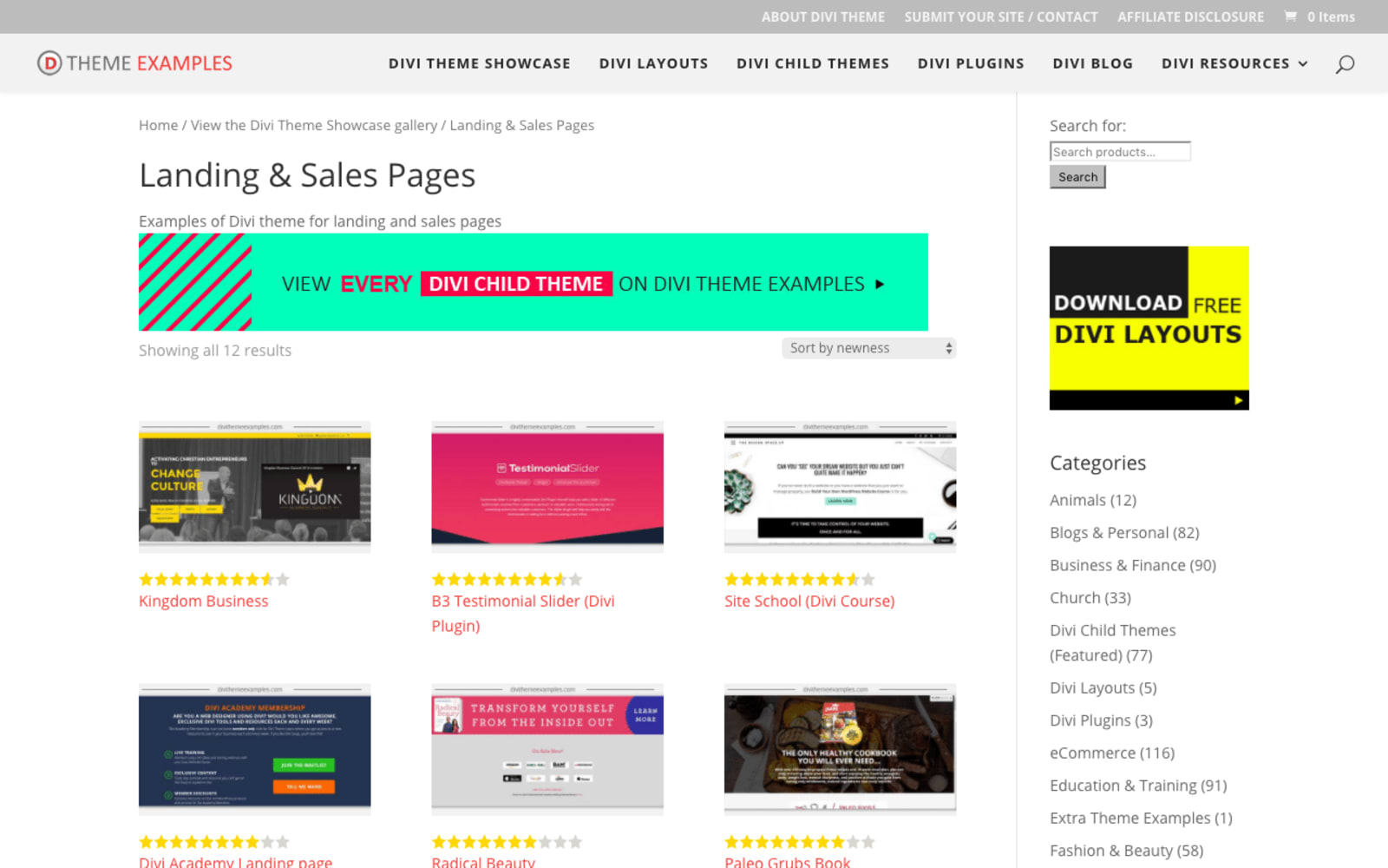
Best Divi Landing Page Layouts
Being a crucial part of a website, landing pages always have to look their best. The best Divi landing pages are a combination of functionality and aesthetics. These two factors will always go hand in hand to make a landing page effective.
The great thing about Divi Builder is that it has a directory of readily available layouts and themes that you can use as a template for your landing page. If you don’t have time to build a layout from scratch, you can just simply choose from their directory.
With their drag and drop feature, you can easily remove and add elements into the layout. Layouts can be free for use or may need to be bought. Here are some of the best Divi landing pages that are free to use.
1. Slide Out Email Optin Box
This layout incorporates animation as graphics. A slide-out call-to-action box will appear as soon as visitors get redirected to this landing page. With an easily visible CTA appearing on the side, visitors will not have to worry about looking for it.
The best part about this layout is its slide-out CTA box that enables the customers to continue browsing through the site without having to transfer from one page to another. They can simply fill out the subscription form on the side while still staying on the same page.
Although the entire layout sports a simple design, the functionality is great. Since the CTA pops out from the side, visitors can scroll down with ease without having to scroll back up to fill in the forms of the CTA.
2. Food Recipe
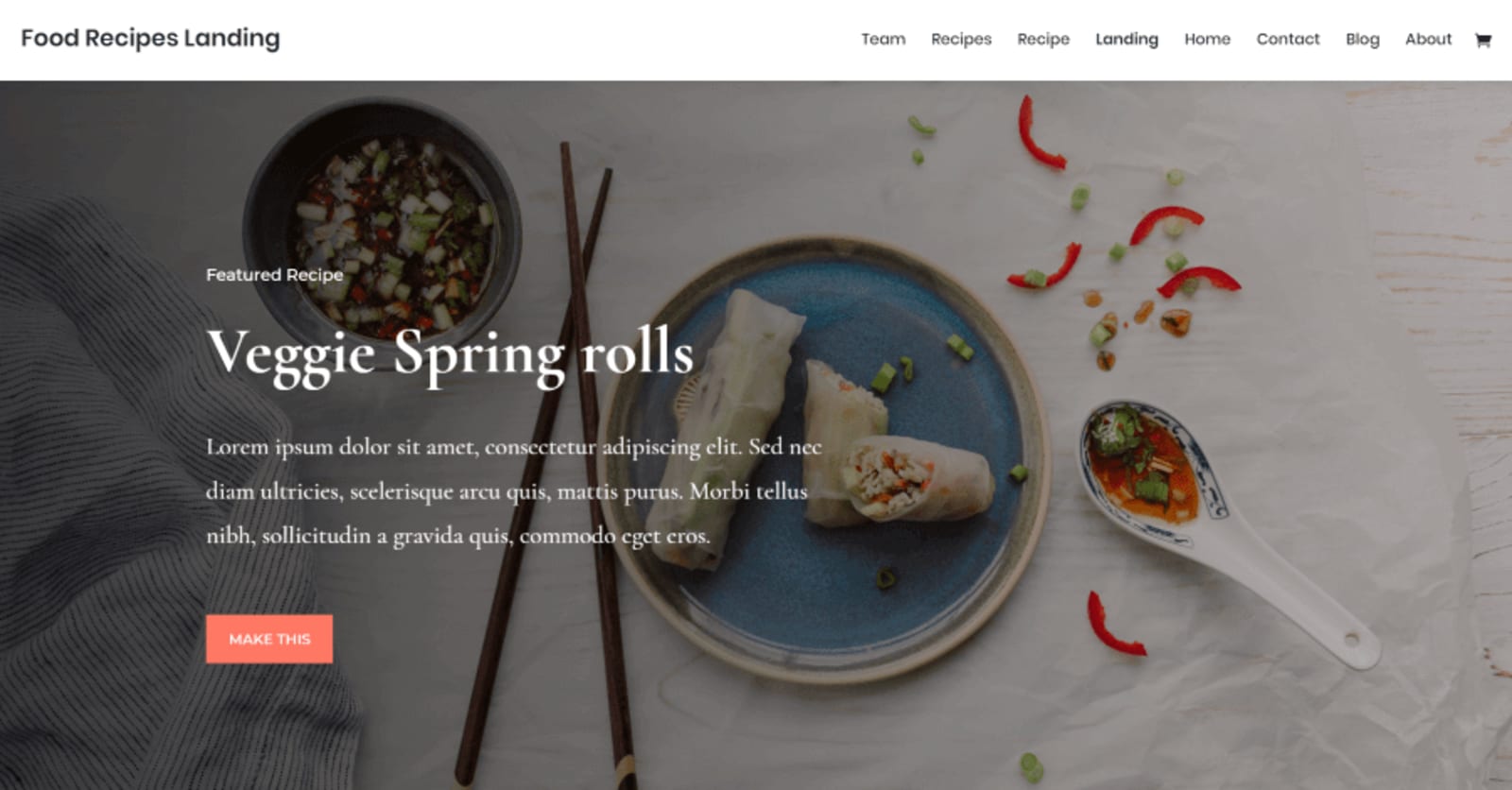
This layout has a full-screen image as its background. The great thing about this layout is that it uses images as options for staff picks and categories. This design has a very neat yet appealing aesthetics.
A navigation bar is available for viewing airfood recipe, blog posts, and the contact and about page of the site and its owner. The call-to-action buttons are easily visible since they are enclosed in orange boxes.
One of the CTAs is located on the top part of the page and the other is in the middle. An email opt-in is also available at the bottom of the page for customer subscriptions.
3. Lndng
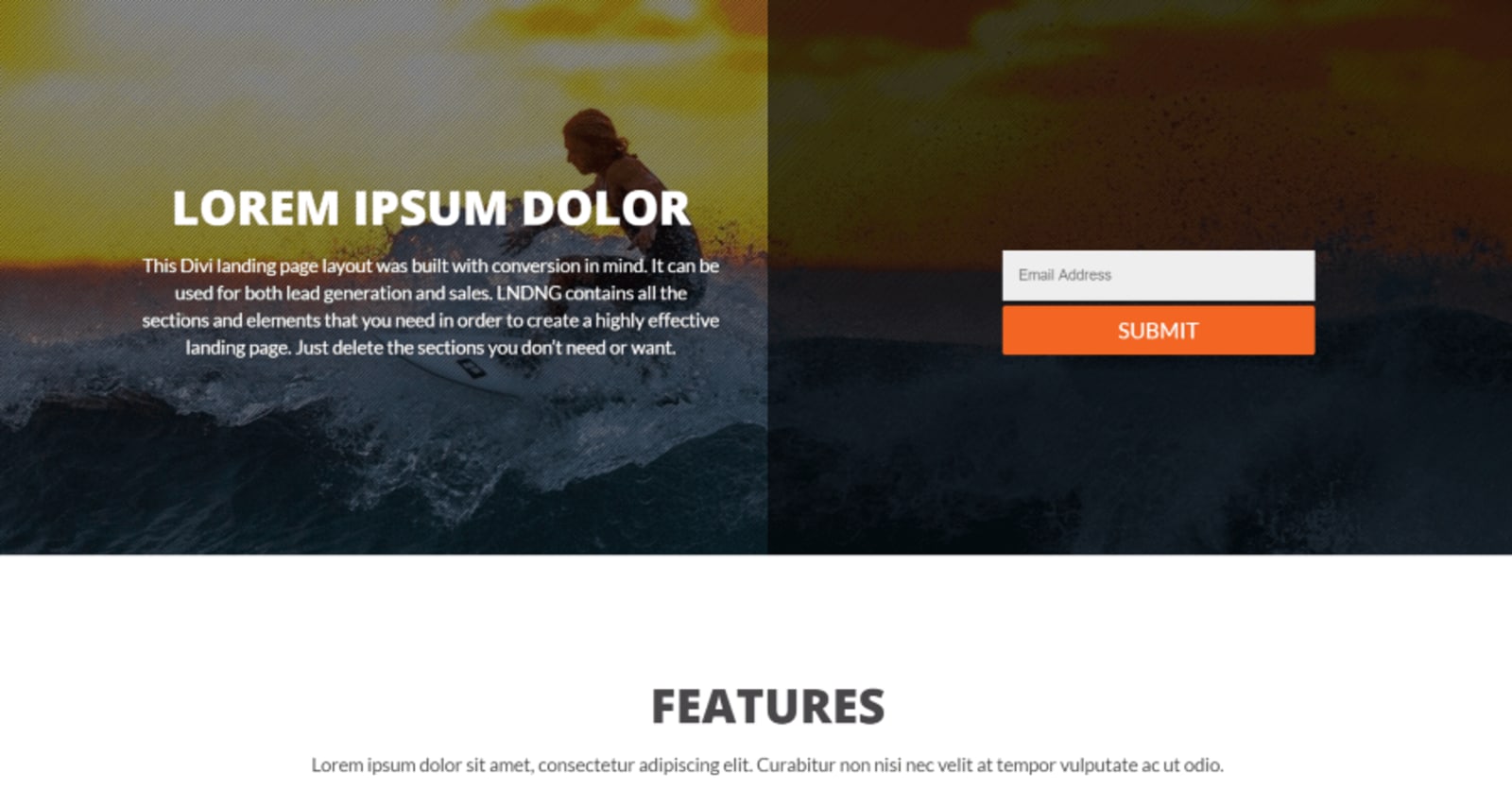
This layout is a single-page template that is mainly focused on visitor conversion. The whole page is filled with CTAs for pricing, an email opt-in for subscriptions, and a two-sided button to catch the attention of visitors.
All of the CTAs lead to the email opt-in which encourages the visitors to subscribe. This not only helps in generating leads but also sales. A testimonials section is also available if you want to display testimonies of past and recent customers.
It is a simple yet straightforward design. What’s great about it is that its functionality is absolutely noteworthy. You can clearly see the goal of the page by just looking at it. And, that’s the most important thing that a landing page does.
This landing page layout is available for use at an affordable price of $7.
4. ConversionLab
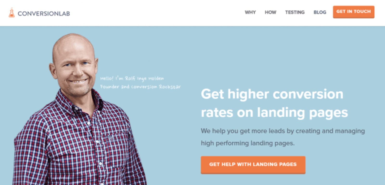
From the name itself, the main focus of this template is conversion. ConversionLab puts emphasis on converting their visitors into customers as they reach their landing page. This is why it is one of the best Divi landing pages available in the market.
The landing page has a navigation toolbar that has the sections “How”, “Why”, and “Testing”. It also has a call-to-action that is very visible. A background image with a handwritten message adds a personal touch to the entire layout.
The entire landing page is filled with call-to-action buttons. But the best part of ConversionLab is its contact form. All the CTAs lead to this spectacular contact form that slides from the right side of the window.
It enables you to subscribe and fill out the form while still browsing around the landing page.
6. Boxit
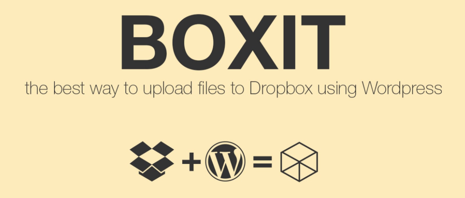
Boxit is a layout that embodies a compact yet clearly expressed purpose of the site’s landing page. The great thing about this landing page layout is that it is direct-to-the-point. It doesn’t confuse visitors with a lot of unnecessary information.
The content on the landing page mainly focuses on the features of the tool. This layout mainly leans on sales generation. So, marketing the product is its utmost priority. The landing page showcases a fixed navigation bar with the Boxit logo on the side.
This is followed by a header and 3 images that are pretty much self-explanatory on what the tool can really do. A blurb module is used for the key features section. A call-to-action that leads to a contact form can also be seen.
The page ends with an instructional video that shows a step-by-step process of the tool’s installation procedure.
7. Design Conference
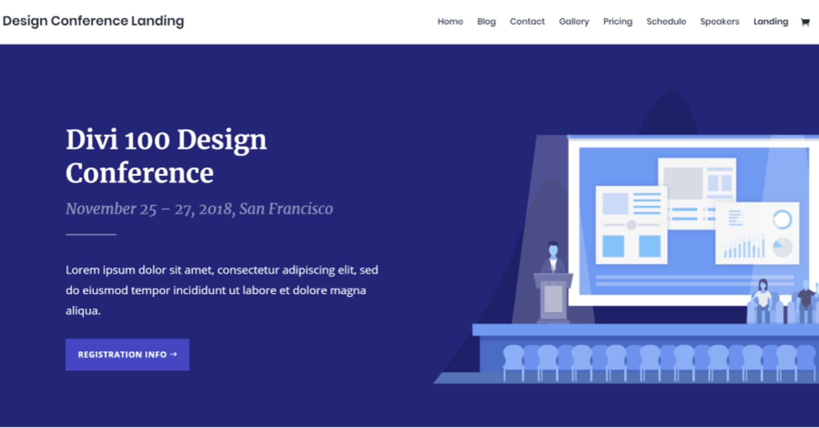
Design Conference is a layout that mainly uses a lot of graphics and animations. As you scroll down the landing page, you’ll notice that there are sliding motion animations on the about section of the page.
The header of the page has a plain background with graphics on the side. A call-to-action button can also be seen right away. A feature section that showcases talks and speakers is also accompanied by a lot of CTAs.
This layout also has a pricing section for their services, a promotional video, and a list of sponsors. An email opt-in and contact form can be seen at the very bottom of their page.
8. TravelersPhD
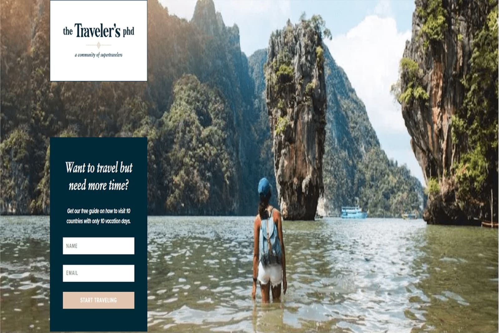
The very first thing you see as soon as you get redirected to the landing page is a large background image that heavily emphasizes that it is a travel website. A fixed email opt-in is also visible on the topmost part of the page.
TravelersPhD mainly focuses on community relations. As you scroll through the landing page, you’ll see information about how the business was founded, its purpose of establishment, and its core mission and values.
It shows the various benefits and perks as well as discounts for registering as a member in a bulleted form. It also has other various calls-to-action for notification and subscription.
9. SaaS Landing
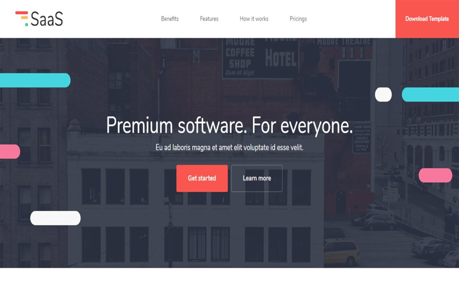
The best thing about using the SaaS landing page layout is its flexibility in usage. The header consists of two call-to-action buttons as well as a graphic background with animations.
The page contains sections for pricing, an instructional guide on how to sign up and gain profits, as well as its perks and features. The entire page makes use of various CTAs that can encourage visitors to subscribe to find out more.
10. Beacon
The Beacon landing page layout features a full-screen background that slides in the opposite direction as you scroll down. A header is present in front of the background as well as a call-to-action button.
There is also an embedded video that can be used to showcase products or instructional videos if you’re selling software. Blurb modules are also present to show the different services offered.
Most of the graphics used have parallax animations that contribute a lot to the landing page’s aesthetics. Lastly, an email opt-in can be seen at the bottom of the page for subscriptions.
Final Thoughts
These are just some of the best Divi landing pages available for download online. With so many to choose from, you’re bound to find the right layout for your business’ website. These layouts include high-quality graphics and images as well as animations.
But, not all of them can be used for free. After all, if your goal is to have a high-quality landing page that can potentially have a high conversion rate, you sometimes need to invest more money to get it.
With elements that make your website stand out, you’ll surely have higher conversion rates in no time.
Here at Delesign, our designers can draft up many mock-ups while incorporating your ideas to create the best template to be used for your website.

Alexis is a freelance content writer with a keen in Business and Finance content. She sees writing as an opportunity for learning which is why she likes to write about various niches.