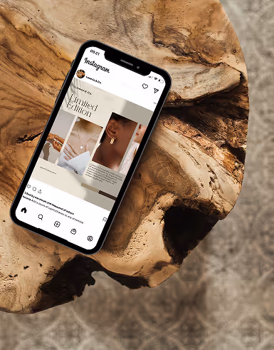
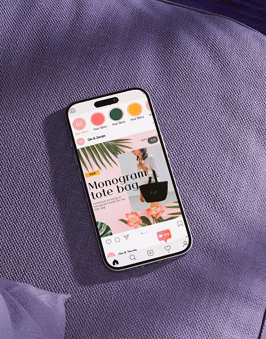
Today, people are endlessly scrolling online. You need to catch their attention in a second if you are to turn them into customers. Delesign can help you create visually appealing materials that will surely make people stop scrolling. Nonetheless, you still need to know some of the best practices in graphic design for social media, which we will discuss here. We will also touch on visual hierarchy and its importance.
Graphic Design for Social Media: Useful Tips and Best Practices
When creating poster templates for social media posts, be mindful of these tips and best practices:

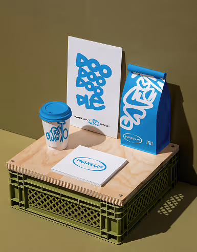
1. Maintain brand consistency
The purpose of social media campaigns is to attract customers and make your brand known to many. As such, it is a no-brainer that your poster templates have to carry your brand and stay true to your brand identity at all times. Doing so is not only fundamentally professional, but it also helps with brand recognition and name retention. The simple acts of putting your logo and using your brand’s color palettes can go a long way in brand communication.
2. Maximize the use of icons.
People do not have all the time in the world to read graphics with heavy text. With the limited average attention span, you only have a few seconds to catch people’s attention, and you need to make the most out of it. When creating materials for social media campaigns, be creative. Use clean, uncluttered icons and other creative illustrations. Aside from attracting more users, doing so will also save you a lot of time.
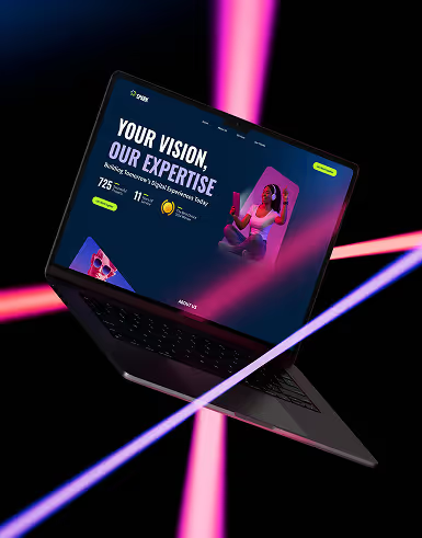
3. Use bold colors.
Right from the get-go, your materials have to draw attention. They have to be noticeable enough for users to stop scrolling on their feeds when they come across your posts. That is the whole point of digital marketing. To ensure that your materials are attention-grabbing, do not be afraid of using bold color palettes. They need to be bold and bright without being hurtful to the eyes. More importantly, these color palettes have to work cohesively and seamlessly with your brand design.
4. Create infographics whenever applicable.
As discussed earlier, people do not have time to read text-heavy graphics, especially when it is all about data and statistics. To add credibility without compromising creativity in your social media posts, visualize relevant information using infographics. These materials are versatile and effective in conveying facts without looking boring. Readers can absorb and appreciate information better if presented in this appealing manner. Of course, your infographics must be factual. Ensure that you embed the sources at all times.
5. Highlight important text.
We do not like text-heavy graphics, that is for sure. However, that does not mean you will never use typography in your materials anymore. If your post is promoting an article, an event, or a product, it is crucial to include essential details in your publicity material . This text has to be the focus of your material, so ensure that it is perfectly readable and uncluttered. It has to be clear enough so that users need not squint their eyes just to know the details.
6. Develop post templates.
One of the best practices in successful digital marketing is having templates for your social media posts. Having these templates maximizes efficiency in the workplace. More importantly, they help make sure that your posts are consistent at all times. When you need material for a social media post, and none of your expert or resident graphic designers is available to do it, you can easily delegate the task to anyone in your team.
Understanding Visual Hierarchy and Its Importance
A study in 2018 revealed that 94% of users would leave a poorly designed website.
Visual hierarchy is a graphic design principle focused on arranging web design elements in terms of significance. It guides graphic designers in laying out elements logically to obtain desired outcomes from users and not drive them away.
8 Elements of Visual Hierarchy
In visual hierarchy, the following elements are controlled to create a more valuable experience for users:
1. Alignment
Readers need to understand and appreciate every bit of information on your website to turn them into active users or customers. As such, ensure a seamless flow of information that makes it easy for them to browse your content.
2. Color
You need to know your colors carefully. What feelings or reactions do they invoke? Are they cohesive with your brand identity? Are they easy on the eyes? Do they make text clear and readable?
3. Contrast
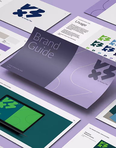
Contrast has a lot to do with your brand guide. Typography, color, and other design elements need to complement one another to create a visually pleasing experience. One cannot overpower another.
4. Proximity
Proximity is an essential communication tool in visual hierarchy. By putting elements close together, you are expressing that these elements are related to one another.
5. Repetition
Repetition is an essential concept in graphic design. Be it your logo, company name, or tagline, having it repeatedly appear on your website and materials help cements your brand in users’ minds.
6. Size
The larger the image or text, the more attention-grabbing it is. The general rule of thumb, for obvious reasons, is to make the most important parts of your web design the biggest. As such, it would not matter where or how your position important information. All you need to do is scale them up.
7. Texture and Style
By playing with texture and style, you are more likely to spark the interest of your readers. Providing an unconventional experience on your website makes them interact and engage more.
8. Whitespace
Whitespace has increasingly become vital in web design nowadays. The more whitespace there is around an element, the more eye-catching that element gets. More importantly, the proper integration of whitespace helps maintain a clean and visually aesthetic design.
Factors to Consider in Creating a Powerful Visual Hierarchy
Considering everything we now know about visual hierarchy, how do you think you can create a strong visual hierarchy? Here are some important factors you need to consider:
1. Gestalt Principles
Essentially, Gestalt principles are laws of human perception, characterizing how we simplify complex images, recognize visual patterns, and observe similar elements. Graphic designers take advantage of their understanding of these principles to create content in a presentable and visually appealing manner, effectively engaging every viewer.
2. Center Stage
The most important information on any material has to take center stage. These elements have to be the first things that people see when they look at your material. To prompt better engagement, you need to tote different user interface (UI) design patterns. One of the most common UI design patterns is breadcrumbs, which is used in navigation tabs. In this design pattern, you use linked labels to create secondary navigation without losing the navigation path.
3. Consistency
We could not stress the importance of brand recognition and name retention any further. Always maintain consistency in your materials, be it on a simple graphic for a social media post or your whole website. Use your logo, familiar icons, consistent color palettes, among others.
4. Typography
Every typography has to match perfectly with your brand design and color palettes. If anything, your brand guide should detail what typefaces to use and how to use them in every material. Typically, your website and other poster templates need to have about three levels of text. For mobile UI design, they need about two levels of text.
5. Whitespace
Whitespace helps calm the eyes from bold and bright colors. Incorporate as much whitespace as needed to create aesthetically pleasing graphics. Never fill your pages with colors. Otherwise, they would look cluttered.
Conclusion
These best practices, along with a significant understanding of visual hierarchy, serve as a guide in making sure your materials are attracting customers and not driving them away. Find out how Delesign can help you create meaningful social media campaigns that yield results by contacting the company here.

Krisana is a journalist turned SEO Content Writer with keen interest in tech, software, and innovations. She is an avid fan of Elon Musk and wants to be part of the future Human Mars Mission. In the meantime, she spends her time researching and writing about everything that could make life a better place on Earth. Outside of work, Krisana dedicates her time with her two lovely kids.