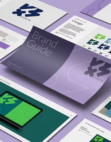
Typography plays an important role in web design. In fact, font choice can be the deciding factor that separates a mediocre website from a great one. Oftentimes, the font you choose for your website’s headings is just as important as the color of your site design. So it’s no wonder that there have been so many studies and articles written about font use on web pages. Good typography helps to create a pleasing, consistent experience for users and can help your site stand out from the competition.
In this article, we’ll look at some of the best practices in improving the typography in web design, including the factors to consider.
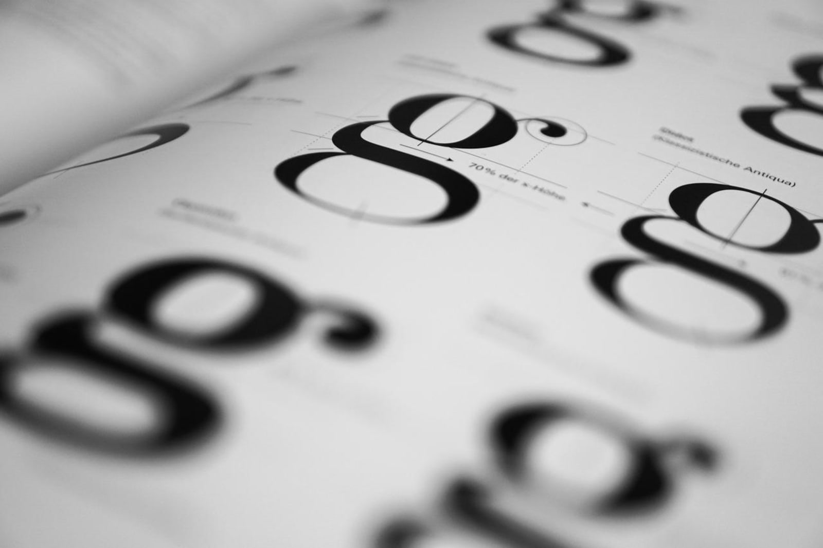
Why Is It Important to Use Good Typography?
Here are five points on the importance of typography in web design:
1. Typography can help to create a unique and memorable user experience.
Typography is often taken for granted, but it can be a powerful tool that helps to create a unique and memorable user experience.
Good typography can make an app or website design look polished and professional, while bad typography can make it look cluttered and amateurish. By paying attention to the details of typeface selection, font size, line spacing, and other factors, you can create an interface that is both easy to use and visually appealing.
2. Typography is a major factor in user interaction and can influence how users navigate your site.
Typography is the art and technique of arranging type to make written language readable, appealing, and impactful. The way text looks on a web page can influence how users interact with it.
Typography should be used to enhance the user experience by making content easy to read and navigate. Good typography can help improve usability by creating a clear hierarchy of information and using consistent fonts and sizes.
3. Typography influences the design and layout of your page, affecting how users perceive the content and interact with it.
The purpose of typography is to communicate the content of a document or web page to the reader. Typography is the style, arrangement, and appearance of text on a page.
The use of typography can influence how users perceive the content on a page. The typeface, font size, line spacing, and paragraph spacing all affect how readable the text is. The layout of the text also affects how users perceive the content. Alignment, spacing between elements, and whitespace all play a role in how well users can read and understand the content.
Good typography makes it easy for users to read and understand the content on a page.
4. Good typography can help to create a consistent experience for users
Consistent typography is key to a good user experience because it helps to create a predictable and familiar interface. Users know where they are supposed to click or scroll, and they can easily scan the text for important information. Typography that is too light or too dark, too big or too small, or in a weird font can be jarring and distracting, making it difficult for users to focus on what they need to do.
Well-chosen typography can help make an app or website look polished and professional, while poor choices can make it look amateurish. By paying attention to the details of your typeface choices and using them consistently throughout your design, you can create a more consistent experience for your users.
5. Good typography is a key component of information architecture and can influence how users navigate your site.
Typography is an important aspect of information architecture because it can influence how users navigate your site. Poor typography can make it difficult for users to read the text on your page, which can lead to them becoming confused and leaving your site.
Good typography, on the other hand, can help guide users through your content and make it easier for them to understand what you are trying to say. In order to create an effective information architecture, it is important to take into account the role that typography plays in user navigation.
Factors to Consider in Improving the Typography in Web Design
There are many factors to consider when improving the typography in web design. Some of which are as follows:
Size
Font size should be relative to the amount of text on the page. A large font is needed for headings and a small font should be used for text.
Smaller screens, whether on mobile devices or desktop monitors, have driven the need for responsive web design. Typography is one of the main factors that to be adjusted for different screen sizes.
The font size and line height need to be increased for smaller screens to ensure that users can read the text comfortably. This also affects the overall layout of the page, which needs to be designed in a way that is easy to navigate on a small screen.
Companies have been especially affected by this trend, as more and more users are accessing their websites through mobile devices. The font size and line height need to be increased for smaller screens in order to make the text readable, and the layout needs to be simplified so that it can be easily navigated on a small screen.
Style
Font style should be consistent throughout the website. Sans serif fonts are best for online reading.
The style of a website can heavily affect the typography within the design. For example, a sleek and modern website might use sans-serif fonts to create a clean and simple look, while a more traditional website might use serif fonts to give it a more classical feel.
In addition, the size, weight, and color of fonts can also be used to create visual contrast and emphasis on specific elements within a design.
Color
Black text on a white background is the easiest to read, but other colors can be used for emphasis.
In the world of web design, typography is one of the most important elements on the page. It's responsible for legibility, creating a hierarchy of information, and adding visual interest. But what about color? How does it affect typography?
One thing to keep in mind when designing with color is that every hue has a different meaning. Red can be aggressive and energetic, while blue can be calming and serene. When choosing colors for your type, it's important to consider what you want to communicate to your audience.
Color also affects legibility. Darker colors can be difficult to read against a light background, while lighter colors are easier to see. Contrast is also important; if two colors are too similar, they may blend together and become difficult to read.
Finally, color can add visual interest to typography.
Alignment
The text should be aligned left, right, or center depending on the design.
Alignment is an important part of typography in web design. The way the text is aligned can affect how easy it is to read, and can also affect the overall look and feel of a website. There are a few different ways to align text, and each has its own advantages and disadvantages.
Left alignment is the most common type of alignment, and it's often used for body text. It's easy to read because the left edge of each line is aligned with the left edge of the text block, which makes it easier for our eyes to track from one line to the next. The left-aligned text also has a formal look that can be suitable for certain types of websites.
Right alignment is less common than left alignment, but it can be useful for headings or other types of important text.
Margins
The space around the text should be kept consistent so that it is easy
Margins are important for a number of reasons when it comes to typography in web design. The first reason is that they help to create white space on the page, which can make the text easier to read. They also help to separate different elements on the page, making it easier for the reader to understand what each element is. Additionally, margins can help to create a more balanced look for a web page, which can be especially important when there is a lot of text on the page. Finally, margins can also be used to control the spacing between letters and words, which can affect how readable the text is.
Fonts
Selecting the right font is important for creating a look that is visually appealing and easy to read.
Fonts are an important part of web design. Different fonts can create different effects, which is why it’s important for designers to choose the right fonts for their websites. Some fonts are better suited for headings, while others are better for body text.
Some fonts are also better suited for online use than others. Fonts that are designed for print use often don’t look good online, and vice versa. There are a number of different factors to consider when choosing a font, including the font’s size, weight, and style.
Final Thoughts
Typography is an important aspect of web design. It can be used to create a visual hierarchy, make the text more readable, and add personality to a website. By understanding the basics of typography, web designers can create websites that are both attractive and easy to use. It can be used to create a visually appealing website or to communicate a message. By using the right font, font size, and color, you can create a website that is easy to read and visually appealing.

Krisana is a journalist turned SEO Content Writer with keen interest in tech, software, and innovations. She is an avid fan of Elon Musk and wants to be part of the future Human Mars Mission. In the meantime, she spends her time researching and writing about everything that could make life a better place on Earth. Outside of work, Krisana dedicates her time with her two lovely kids.


