The internet is an ever-evolving sea requiring an inflow of information per second. Businesses make use of infographics to get the attention of potential customers. To achieve your aim as a business, you need the best infographic designs and portfolio as a template.
Many business owners have no idea where to access such important resources. If you fall into this category, we wrote this post just for you. We will provide you a few examples in this post. Also, we will explain what infographic is, give you a few benefits, and a few guidelines as well.
Defining Infographics
Infographics are not your regular kind of graphic design. They combine graphic design with data and content. More like a three-in-one kind of graphic that communicates the idea of a marketing campaign.
Infographics help to break down complex data so that anyone can grasp it easily. It also helps to create captivating graphics from dry information. Now, let’s look at some examples.
Best Infographic Designs and Portfolio
For you to come up with great infographic designs you need some inspiration. Where and how do you get such inspiration? By viewing examples of the best infographic designs and portfolio.
Finding these might be challenging so here’s a list of our top infographic designs to help.
Well-balanced Blog (LinkedIn)

Each day, businesses come up with new infographic designs. This means that the market is becoming overly saturated with this kind of content. It is important to find creative and unique ways to soar above this competition.
The well-balanced blog infographic from LinkedIn does this efficiently. The first approach is to create a visual metaphor that communicates when you should post different kinds of blog content. This approach makes the information easy to understand and exciting to read.
Another thing it does is to appeal to the visual senses of the reader through excellent photography. It has photos of grains, vegetables, and meat that give it a unique personality.
What do we learn from this design? Mixing up infographics is better than sticking to the norm. There are different styles to experiment with, just be creative.
The Sound of Color (Kelly-Moore Paints)
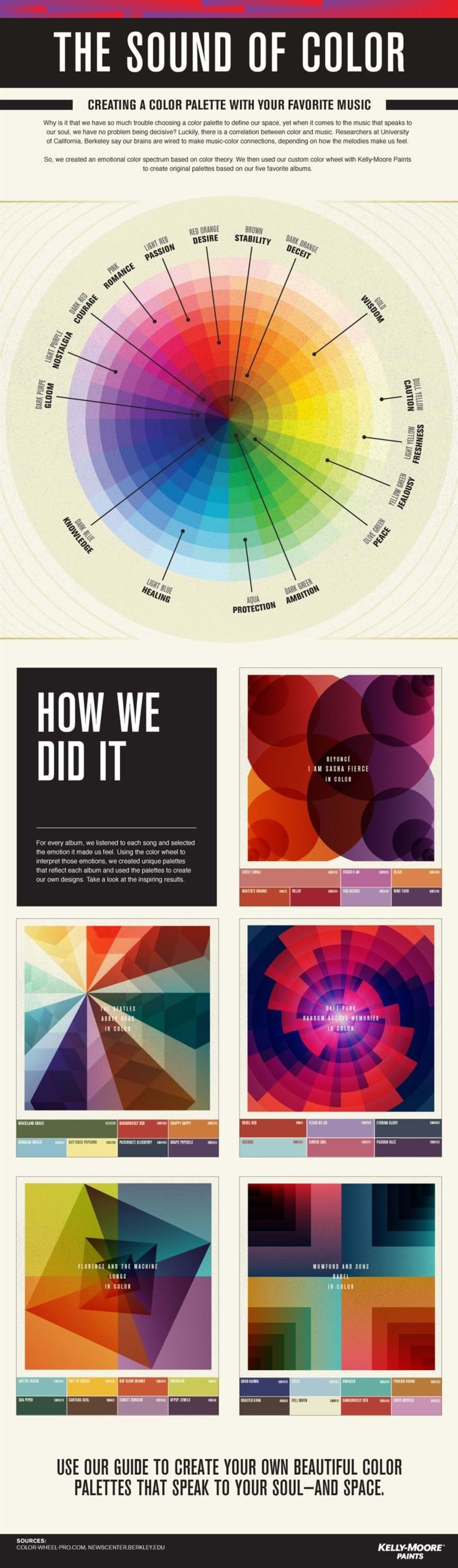
This is one of the best infographic designs and portfolio that explains the concept of color properly. The truth is that it can be quite challenging finding the right colors for different projects.
This is why Kelly-Moore Paints blessed us with this brilliant idea. According to this company, you can choose your color in relation to your favorite music. This is a very unique method of showcasing their expertise in colors.
Here’s what we learned from this piece. There are so many creative ways of showing off your brand. This piece presents you with about 16 ways to come up with infographic ideas.
Boulder is For Fun (AppliedTrust)
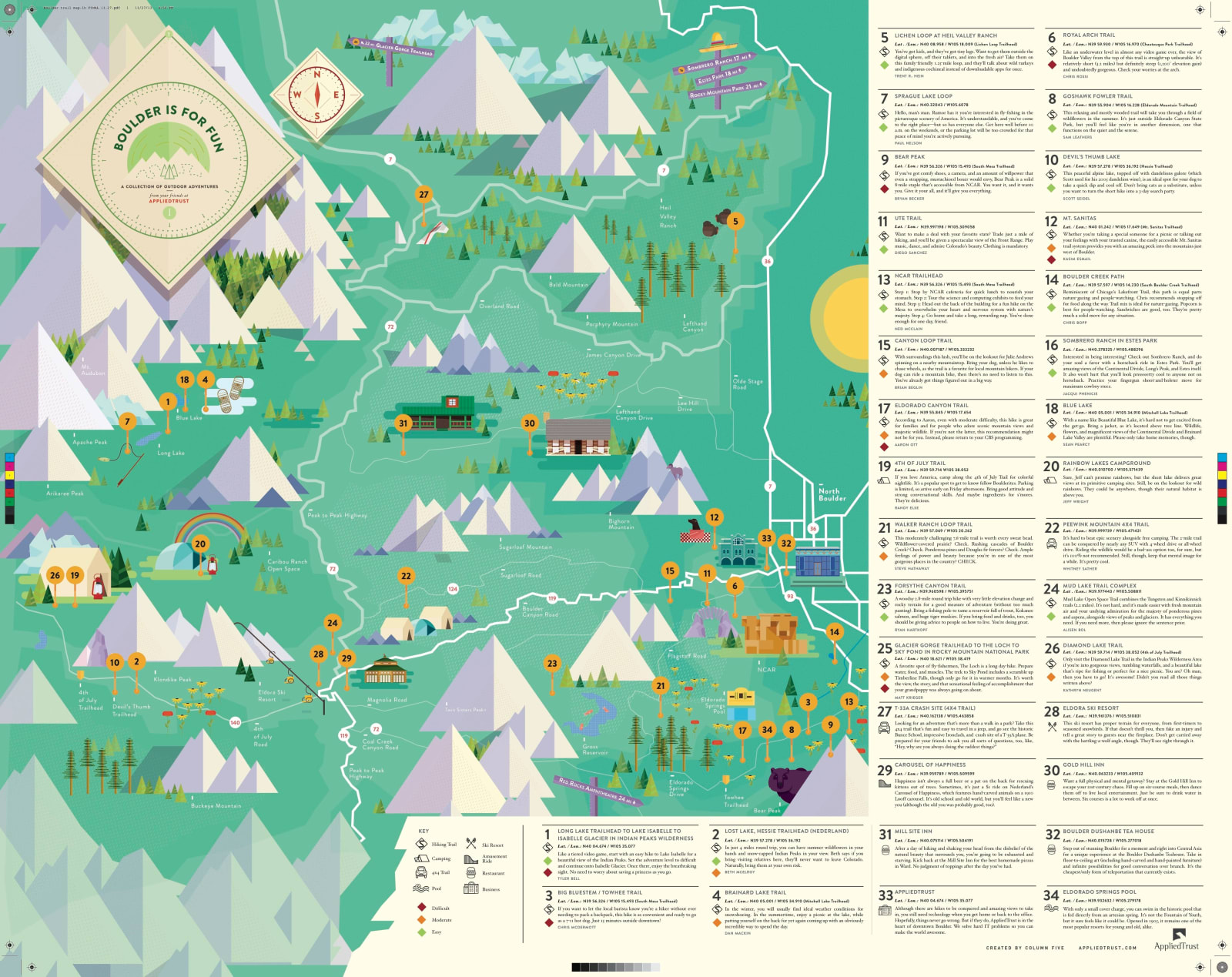
It is almost impossible to talk about the best infographic designs and portfolio without mentioning a map. AppliedTrust presents us with a tourist’s guide showing the nature trails of Colorado and Boulder. Following this, it creates a huge desire to travel in anyone who reads through this piece.
The infographic has a retro style mixed with intricate illustrations. It is no doubt a great resource for anyone who loves to travel or go on an adventure.
What does this piece prove? It shows us that there are more ways than one to spin boring info into appealing content. You can adapt this method for annual reports, press releases, and other supposed boring content.
Carbs are Killing You (Massive Health)
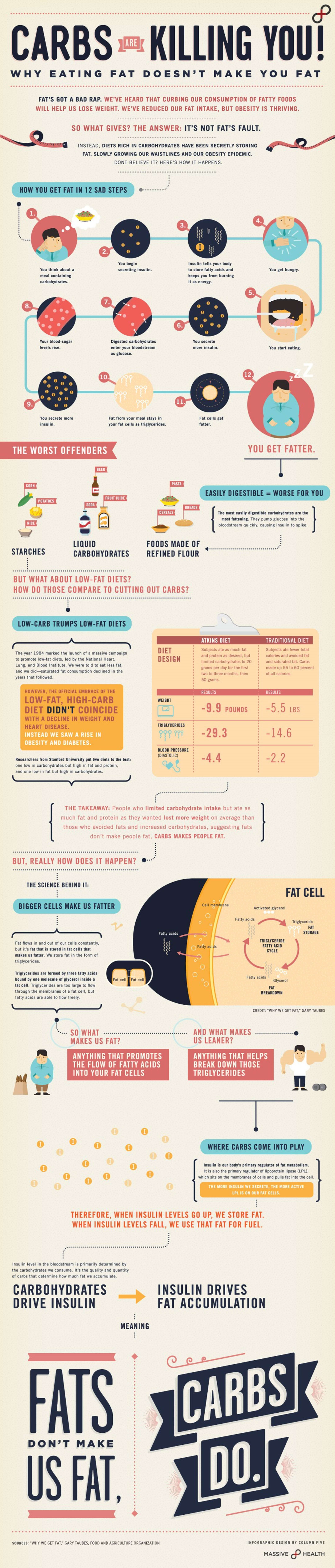
Over and over we have heard of the need to reduce fat consumption so we can lose weight. This infographic drives the message home in the coolest way possible. It shows us that fat isn’t completely to blame, we should watch out for carbs as well.
This piece by Massive Health walks you through the complex process in an excellent manner. It explains how carbs are more dangerous than fats. We cannot deny the illustrative style in which the message comes across.
Here’s what we gain from this design. You can elevate your infographics with great design.
The Almighty Dollar (GOOD Magazine)
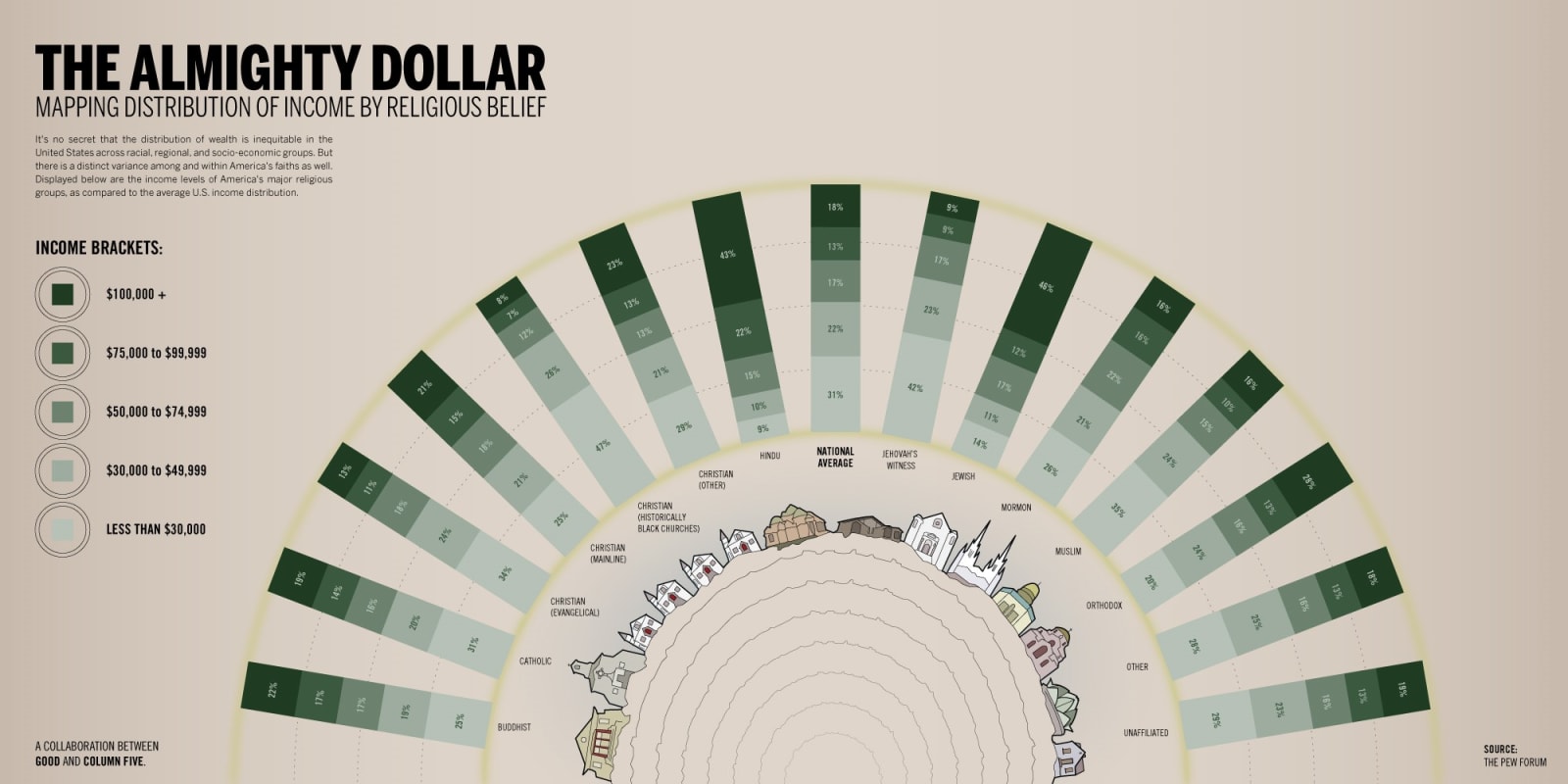
The beginning of all great infographic designs is the content. You need this more when you want to tell a story with your data.
GOOD Magazine explores this approach in this piece. It gives a picture of income levels across religious groups within the US. The unbiased approach does a fantastic job showing us this data in the most straightforward way possible.
What can we learn from this? You can help people have a better understanding of complicated data with your infographics. This will do a lot in passing your complicated messages across.
Making Better Infographics
Now that you have seen some of the best infographic designs and portfolio, let’s show you how to make yours. Creating quality infographics requires skill, time, and creativity. While there are so many infographics on the internet, some standout. In this section, we will provide you a few guidelines that will make you succeed with your infographics.
- Always begin with creative briefs: A good brief is a way to start the process. This will give the designer a clear picture of what you want to achieve.
- Follow best practices: Just like it is with regular design, there are tiny bits of practices that help you get the best results. Seek them out and follow them.
- Tell a story: Always make sure that you tell a story with your infographics. It is not just any kind of story, your story should be relevant to the campaign.
- Work smarter: There’s no need to stress yourself starting from scratch. Surf the internet for inspiration and gain access to tons of resources.
- Promote your work: Creating designs is one step. You need to optimize the infographic to attract traffic. Find the best ways to do this and apply them.
- Find an agency: You don’t have to stress yourself by designing the infographic. There are agencies that can handle this on your behalf at an affordable cost. Find them to save time and get more quality.
Benefits of Using Infographics for your Business
With each passing day, the human attention span is decreasing. Having access to the best infographic designs and portfolio can help you do more with your marketing. Here are a few reasons why you can’t do without infographics.
- Boosts your brand value - Infographics do more than just tell people about your brand. It interestingly shows your knowledge and value.
- Makes content viral - These designs carry a lot of information about specific subjects. As a result, they are very potent in making content go viral.
- Boosts SEO - When you post an infographic on your website, it helps to generate backlinks, especially when shared on social media.
- Grabs attention - It is easier to attract attention and keep it on your information with infographics.
- Demonstrates expertise - Since these designs make use of graphs, tables, and charts, the show off your expertise. They do this in an exciting manner that enhances your credibility.
Conclusion
We believe that now that you have seen some of the best infographic designs and portfolios, creating yours will be easier. If you need help in creating quality infographics, then Delesign has all the right resources for you to leverage on from freelancers to free graphics.

Maria is a Content Writer with keen interest in eCommerce and Internet Marketing. She is a Communications graduate and understands what it takes to write persuasive copy and blog posts. Outside of work, you can find her mini-blogging about her life on social media.