Analogous Colors: Exploring the Harmony and Usefulness in Design
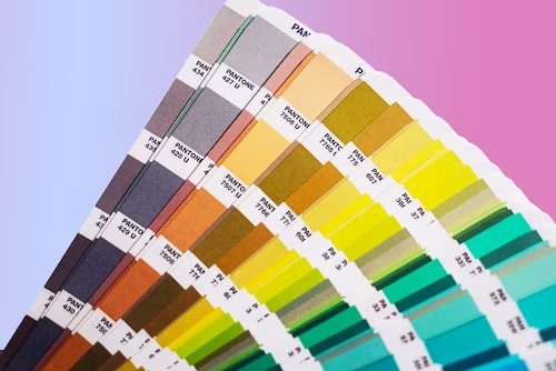
The color wheel guides us among the different colors that usually complement each other. It gives us an idea of what colors closely resemble in terms of their hues and tone. To make the pairing of colors easier, we now have analogous colors - which are created to make an appealing band of colors.
Together, these colors create symmetry in an image or artwork. Instead of randomly picking colors, an analogous color scheme brings complementary colors together. The term analogous is roughly derived from the word "analogos" which, in Greek, means according to a ratio or proportion. Thus, the birth of creating an analogous color scheme to make a logo, artwork, or illustration more proportional.
Understanding Analogous Colors and Their Significance in Design
Analogous colors are a group of three colors that are adjacent to each other on the color wheel. Picture a rainbow - you know, the beautiful arc of colors? Well, on the color wheel, you have a similar setup, and analogous colors are those that sit close together on that wheel.
When you use analogous colors in your design, you create a sense of harmony and unity that's pleasing to the eye. These colors have a natural relationship like they're soulmates. It gives your design a cohesive and balanced look, making it more visually appealing.
Here are a few color combinations that work well in coming up with an analogous color scheme:
- Red, red-orange, orange
- Blue, blue-violet, violet
- Yellow, yellow-green, green
- Violet, red-violet, and red
As you can see, the visual representation of these colors is closely related to their position in the color wheel. Analogous colors drive that familiarity and cohesiveness in an image, allowing a viewer to have a sense of connection across the colors. It allows for a better viewing experience instead of random bold colors that don't match. With analogous colors, you combine different colors and yet achieve continuity in the eyes of the viewers. Impressive, isn't it? So let's get into how you can create an analogous color scheme.
The Basics of Analogous Color Combinations and How To Create Them

– Step 1: Choosing a Dominant Color
The dominant color is the primary hue you will be using in an analogous color scheme. Usually, this will be the strongest or closest to the primary colors for better visibility. The dominant color could be the darkest shade or one that has a stronger presence when matched with other adjacent colors on a color wheel.
– Step 2: Selecting Adjacent Colors on the Color Wheel
Next is picking adjacent colors from your dominant color. Choose one that would blend well as a harmonious hue option. The second color selection doesn't have to be one color - you can even pick more than one color that complements the dominant color.
– Step 3: Balancing Warm and Cool Tones for Visual Interest
Temperature variations are important in an analogous color scheme. By selecting warm or cool tones, you balance the look and create a contrast. This is an important aspect of creating an analogous color scheme. The image must have a bit of contrast - either a darker or lighter shade of the color you're selecting.
The Psychological Impact of Analogous Colors on Viewers’ Perception
Combining colors that closely resemble or match is already a habit in people's minds. This visual coherence is widely studied in various studies, supporting the idea that analogous colors are what it takes to trigger an action or emotion in an audience.
The psychological impact of analogous colors is all about creating a specific emotional response in viewers. When we see these harmonious color combinations, our brains start doing a little dance of happiness. Analogous colors create a sense of unity and cohesiveness, which leads to feelings of comfort and calmness. It's like wrapping yourself in a warm, cozy blanket of colors.
Our brains are wired to perceive patterns and harmony in the world around us. When we encounter analogous colors, our brains go, "Hey, these colors are besties on the color wheel!" This triggers a positive emotional response, making us feel more at ease and drawn to the design.
And how is this important in business, for instance? Well, for one, 60% of users decide to accept or reject a product based on its color. That makes it crucial to make your product branding and whatever visual presentation appealing to the audience. Various studies have supported the idea of having colors interpret brand personality to make the marketing activity succeed.
Analogous Color Schemes in Various Design Fields and Applications

- Graphic Design: In graphic design, analogous colors are a go-to choice for creating visually appealing and harmonious compositions. They work wonders in designing logos, posters, brochures, and social media graphics. Whether it's a subtle gradient or a bold color block, analogous colors can communicate the brand's message and evoke the desired emotions effectively.
- Web Design: On the web, analogous colors are a web designer's best friend! They are commonly used to establish a pleasing and cohesive color palette for websites. By choosing analogous colors for elements like buttons, headings, and backgrounds, designers create a seamless user experience that feels comfortable and inviting.
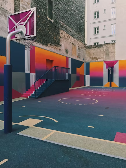
- Interior Design: Inside homes and spaces, analogous colors set the mood and ambiance. In interior design, they are used to create color schemes for rooms and even entire houses. These color combinations bring a sense of flow and continuity, making the space feel unified and balanced.
- Fashion Design: Analogous colors make a bold statement in the world of fashion. From clothing and accessories to footwear and makeup, designers use these harmonious color combinations to create stylish and coordinated looks. Fashionistas know that analogous color outfits can be both sophisticated and eye-catching.
- Photography and Filmmaking: In photography and filmmaking, analogous color grading and color correction techniques are applied to enhance the overall visual impact. By tweaking the color palette to focus on analogous tones, photographers and filmmakers can create a specific mood or atmosphere in their work, adding depth and emotion to their storytelling.
Unlock the Power of Analogous Colors to Enhance Your Designs
Experiment with various colors and adjust them accordingly. This will help you create more pleasing combinations using the analogous color scheme. You can create a contrasting effect - one that looks complementary instead of an out-of-place color combination. By picking any element from an analogous color, you can set one to become an accent piece or have a pop of complementary color somewhere along the image.
Another trick is to experiment with different brightness or saturation levels. This will allow you to have an image that looks interesting due to the varying tones. By having different tones, you allow the viewer to have different points of interest within a single view.
If the principles of analogous colors are still confusing, it's best to consult with professional graphic artists. Unlimited graphic design services like Delesign can help you produce an analogous color scheme whether that's for a logo, an infographic, or even an entire website design. The advantage of an on-demand graphic design service is you can assign as many design tasks. It gives you more flexibility to focus on your business while making your graphic designs up to the standard and best practices.


