Contrast is an important aspect of design. Applying design contrast makes the material look more interesting and not monotonous. It adds levels of interest to increase the visual appeal. But how do you make sure to follow the principles of design contrast?
The principles of design contrast take into account various elements and design characteristics. Contrasting an image allows viewers to focus on one part of the image. This is how contrast helps - by directing viewers to an element or part of an artwork that needs to be highlighted. There are other ways to make contrast work in design.
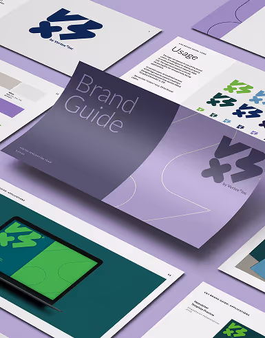
When you work with digital graphics, maintaining color contrasts becomes immensely important, especially while converting images from one format to another compatible one. Mostly when you're going with a vector format like SVG from an ordinary format link PNG, this is where you can proceed with png to svg converter to ensure that the colors and details remain intact with proper vector-image tracing. Such tools quickly convert png to svg graphics with giving different color preset options, after conversion one can maintain or enhance contrast corresponding to your design needs with relevant tools.
The creativity involved in design contrast is done to make an artwork or illustration stand out. The idea behind contrast is to make certain elements pop out, making them the focal point of attention within a design piece. Whether that's the color, space, font, texture, or any other element, the principles of design contrast can transform an otherwise boring art into one that can easily catch anyone's attention. Here are some of the principles of design contrast that would do well in various graphic design scenarios:
1. Color Contrast
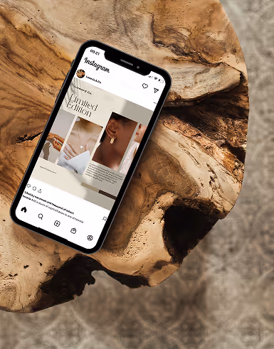
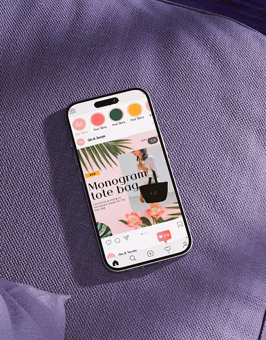
This is one of the most common types of contrast. It involves using colors that are distinctly different from each other to create visual separation. High color contrast can draw attention to specific elements or convey different emotions. For example, using black text on a white background creates strong color contrast, making the text highly legible.
The usual way to contrast colors is by matching two colors that are distinct from one another. This can be a light color against a dark color to make certain elements in the graphics command attention. Be careful though when combining and matching colors. While the aim is to contrast them, it's likewise important to consider if they'll complement. The trick here is to find a color that's opposite within a color wheel to make the color contrast more pleasing to the eyes.
2. Tone Contrast
Similar to color contrast, tone contrast focuses on the difference in brightness levels. For instance, using a dark element against a light background or vice versa creates tonal contrast, making the element stand out.
Adjusting the brightness level or making a portion of an image darker will achieve a tone contrast. Pick one part of an element of the entire design piece that you want to have a darker tone or lighter tone to achieve a contrasting effect. Usually, this is used to put the focus on one element of an image.
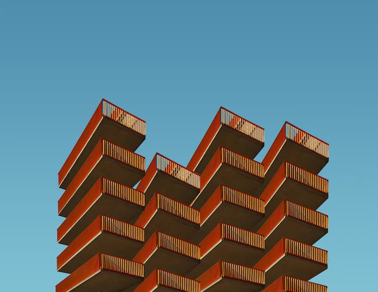
3. Size Contrast
Varying the size of elements can add visual interest and hierarchy to a design. Larger elements tend to attract more attention, so contrast in size helps guide the viewer's eyes to important focal points.
Contrasting sizes make an image less monotonous. It adds a layer of interest for the viewer, making them look at elements with bigger sizes while having minor elements at a smaller size. Instead of one whole image, a viewer can break them into either smaller or larger parts, which helps in the storytelling aspect of an image.
4. Shape Contrast
This involves using different shapes within a design. Geometric shapes, organic shapes, or a mix of both can create a dynamic composition and visual diversity.
For instance, circular elements could be paired with sharp-edged elements to make the design look more interesting. Different shapes, when combined, add more energy to an otherwise boring illustration.
5. Texture Contrast
Incorporating different textures or surface qualities can add depth and tactile interest to a design. Smooth textures next to rough textures create noticeable contrast.
It could be simple design elements like small, repeated patterns that will provide texture to an image. Have an opposite texture, like a smoothened out or plain graphical elements, to make the contrast even more recognizable.
6. Typography Contrast
Involves using different font sizes, styles, weights, and colors to distinguish various text elements. Headings with larger and bolder fonts compared to the body text exemplify typography contrast.
Another effective way to do a contrast is by using different fonts. However, be careful in choosing which font. While picking a contrasting font, they should also look good together and not be too distracting. It can either be fonts that complement well when placed against one another or two completely different font themes for a standout contrasting look.
7. Spatial Contrast
This deals with the placement and spacing of elements. For instance, positioning a small element close to a larger one can create spatial contrast and direct attention.
The trick here is to create dimensions within an image. Aim to provide an ample distance to make certain elements stand out. This will help make the viewer's eyes focus on one element that you want to highlight.
8. Style Contrast
Combining different design styles, such as modern and vintage, can create a striking visual impact, especially when done thoughtfully. It has to put design styles that are not related to one another to make an effective contrast.
Look for design styles that you can incorporate without them overbearing or too overwhelming when combined. Another way to pull this off is by making one style more prominent than another to emphasize contrast.
9. Directional Contrast
Refers to the use of different angles or lines that guide the viewer's eyes in specific directions. This can lead to an exciting and engaging visual experience.
Another way would be to integrate directional contrast in the different parts of an illustration. Have various parts or elements in an image go across different or opposite directions. Make various elements like angles or lines direct the focal point of an image.
10. Conceptual Contrast
Involves contrasting ideas or themes to create intellectual interest and provoke thought. With so many design concepts to choose from, you can easily find one that you can contrast. Contrasting different concepts can help provoke an idea or make your artwork a lot more interesting.
AI or tech design concepts may be embedded with historical themes to make for an interesting design piece. For businesses aiming to integrate such advanced tools effectively, partnering with AI strategy consulting services can provide tailored guidance and ensure seamless adoption. Be creative in looking for contrasting design concepts that you can combine for intriguing artwork.
Need Help With Design Principles?
Aside from design contrast, there are other principles that you need to follow to create appealing graphics. Thus, you need professional and creative graphic artists to help you produce designs that follow certain design principles. These design principles guide graphic artists in producing compelling artwork. Without proper knowledge and application, you could come up with graphic designs that are not attractive enough or useful for an audience.
Graphic designers from design firms like Delesign are thoroughly aware of the principles of design contrast. They also go through a stringent hiring procedure to ensure that they are knowledgeable and skilled in various design principles. This allows clients who subscribe to the on-demand graphic design service from Delesign to have graphics and videos that are aligned with industry standards.
With Delesign, you can have access to available talent without the need to commit to restrictive contracts. The subscription model of the design service allows you to assign as many projects as your business requires without paying a hefty price tag. The result? Wonderfully made graphic designs that follow standard design principles. You will have all kinds of artwork - from logos to banners - that are aligned with industry best practices.

is involved in SEO and digital marketing. He gravitates towards upcoming technologies, startups, and is an avid learner.